2 Sector Exclusion
Vaska Atta-Darkua and Elroy Dimson1 Cambridge Judge Business School 13 August 2018
Abstract
Using industry indices spanning 1900–2018 we investigate the impact of sector screening for a well-diversified long-term investor. We identify a number of risks associated with this strategy. Industry returns may deviate from market returns because of changes in sector composition over time and the large cross-sectional dispersion of sector returns. Consequently, market returns are not a substitute for industry returns. Sector divestment is equivalent to allocating a portion of the portfolio to a strategy that is long the market and short a sector. This holding would introduce unwanted geographic tilts into the portfolio, and could suffer substantial and lengthy drawdowns.
2.1 Introduction
Many investors incorporate screening within their investment process. Negative screening involves excluding companies based on criteria that may be specific to individual issuers. For instance, potential investments may be regarded as unsuitable based on environmental, social and governance (ESG) criteria. Frequently, screening is based on a set of common attributes. There are many examples. Health-oriented investors prohibit exposure to tobacco companies; strict Sharia funds avoid bank stocks; Dharmic investors may exclude animal-testing pharma companies; social campaigners avoid firms with poor ESG scores; politically sensitive investors avoid rogue-state markets; institutions constrained to spending income underweight low-yield stocks; and climate-change activists pursue divestment from fossil-fuel businesses.
In some cases, the decision to disinvest is commercial, such as the argument that certain assets are likely to become stranded because of anticipated impairment of their economic value. As an illustration, transport has a long history of investments becoming of little value after a change in technology. As we discuss later, canals drastically cut the cost of long-distance transport and largely obsoleted horse-drawn carts; railways then hugely undercut the cost of water-based transport and drove canals into disuse; and for long-distance travel, buses and aircraft then propelled many rail services into financial distress. Looking forward, autonomous vehicles and transport-as-a-service may force automobile plants into closure. At each disruptive event, older assets that have not reached the end of their technical life are no longer able to earn the return anticipated at an earlier date. Recently, the transition to a low-carbon economy has led to predictions that fossil-fuel industries will become stranded assets, and that it could be financially attractive to sell out of coal, oil and gas stocks.
Norges Bank Investment Management (NBIM), which favours converting the Government Pension Fund Global (GPFG, or the ‘Fund’) to a fossil-free structure, does not dwell on stranded-assets arguments. NBIM is agnostic about whether these energy stocks are likely to fall in price. Their concern is capital preservation for the Fund. NBIM (2017) “conclude that the vulnerability of government wealth to a permanent drop in oil and gas prices will be reduced if the fund is not invested in oil and gas stocks, and advise removing these stocks from the fund’s benchmark index.” NBIM note that “This advice is based exclusively on financial arguments. It does not reflect any particular view of future movements in oil prices or the profitability or sustainability of the oil and gas sector” (ibid).
In this paper we focus on the component of government wealth that is invested in the Fund. Discussion of whether Norway as a whole is overexposed to the fossil-fuel sector would require consideration of the merits of divesting from state-owned oil, gas and coal businesses, a topic that we do not address. Our attention is given to the impact of sector exclusion on an otherwise well-diversified equity portfolio managed by a long-term investor.
Our research approach is historical, and involves a comparison of industry returns with market returns. We examine the impact on investment performance from sector exclusion, and extend our investigation beyond the energy industry to consider a substantial number of sectors, seeking to answer questions such as the following:
In the long run do sectors provide returns close to the market?
Is sector exclusion likely to increase the probability of underperformance?
Do indices in a resource sector behave like the underlying resource?
Should investors avoid holding stocks in declining industries?
Should a long-term investor favour growth sectors?
What is the impact on an actively managed global equity portfolio of sector exclusion?
In brief, we find that the downside risk from sector exclusions is higher than many writers have suggested. For long-term investors, the consequences of sector exclusion are likely to be economically significant.
2.2 Data2
Our study primarily examines the United Kingdom and the United States, with occasional references to other international evidence. We use the dataset compiled by Dimson, Marsh and Staunton (2018), hereafter referred to as the DMS database, the London Share Price Database (2018), and various public-domain and proprietary industry indices. The series begin at start-1900 or, occasionally, at later dates such as 1911.
Our long sample period witnessed many changes. As Figure 2.1 shows, the UK railway sector was extremely large at the start of 1900 but by 2018 it had shrunk almost to zero, whereas banking and insurance, beverages, tobacco and utilities survived. Moreover, some sectors changed radically: compare telegraphy in 1900 with telecoms in 2018. When analysing sector returns, we should therefore bear in mind that industries experienced great transformations. In 1900, telephones, cars, electric lighting, movies and recorded music were new technologies. Some industries were destined to grow, including electricity and power generation, automobiles, airlines, oil and gas, information services, and entertainment; others such as horse-drawn carriages, canal boats and candles were destined to disappear.
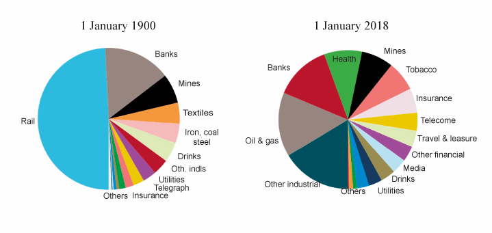
Figur 2.1 Sector market capitalisations in the United Kingdom
Kilde: DMS (2002, 2018), FTSE (2018), original charts © Dimson, Marsh, Staunton (2018).
For the UK market, industry indices are constructed based on the top 100 UK companies for the 1900–1955 period, and based on the London Share Price Database for 1956 to 1961. Following that period, we use FTSE International industry indices and predecessor indices assembled by the Institute of Actuaries and Financial Times. In 1900, over 65% by value of the total UK equity market was in industries that, today, no longer exist. In 2018, 47% by value of the total UK equity market was in industries that, in 1900, had not yet come into existence.
The evolution of the equity market in the United States resembles the United Kingdom. Figure 2.2 reports the breakdowns of market capitalisations in the USA. In 1900, over 80% by value of the US equity market was in industries that, today, no longer exist. In 2018, 62% by value of the US equity market was in industries that, in 1900, had not yet come into existence.

Figur 2.2 Sector market capitalisations in the United States
Kilde: DMS (2002, 2018), FTSE (2018), original charts © Dimson, Marsh, Staunton (2018).
For the US equity market, the data sources employed are as follows. For 1900 to 1925, the 57 industry indices in Cowles (1938) are used. Of these, 20 industries start in 1900. For the later period of 1926 to the end of 2017, we use industry data reported by French (2018). His website contains 49 industries, of which 40 begin in 1926.
2.3 Long-term returns3
We use the UK and US industry return series described above to examine our first question: In the long run, do sectors provide returns close to the market? Figure 2.3 shows the 11 industries for which continuous data is available for the UK. Market returns are plotted in red, showing that £1 invested in the market in 1900 would have grown to £40,838 by the end of 2017, assuming dividends were reinvested. Over the 118 years since the start of the last century, the worst industry performer, engineering, would have increased to £3,388, providing an annualised return of 7.1%. The best-performing industry (alcoholic beverages) had a cumulative value in Figure 2.3 of £403,234 that was 119 times as large as engineering. The annualised return from alcoholic beverages was 11.6%.
Due to post-war nationalisation, which was reversed in the Thatcher-era privatisations, there is a gap in the returns history for UK railways, utilities, telecoms, steel, coal and shipbuilding. As a thought experiment, we might imagine that these return gaps could be bridged. This would likely reveal still greater extremes of performance.
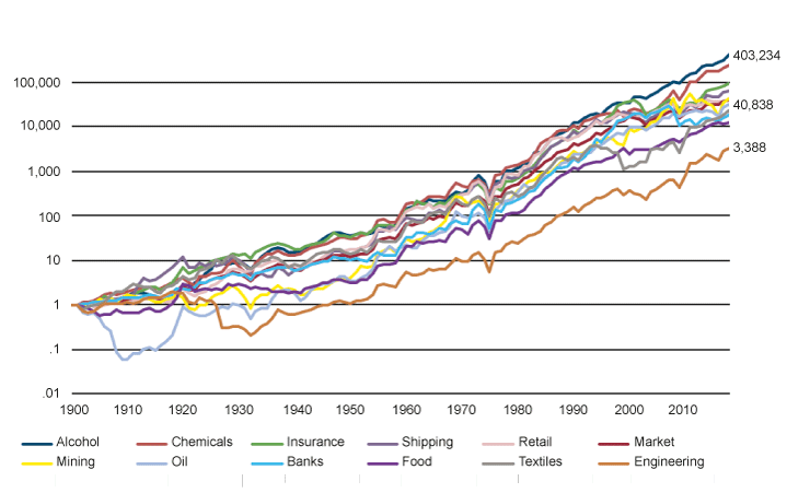
Figur 2.3 Cumulative value of £1 invested in UK industries 1900–2017
Kilde: DMS (2015), Thomson Reuters(2018), original chart © Dimson, Marsh, Staunton (2015).
It should also be noted that Figure 2.3 is subject to survivorship bias. In order to display a continuous 118-year return history for the displayed industries, the sample needs to be restricted to industries that existed in some form during 1900 and 2018, and every year in between. If we were able to access indices for industries that disappeared, the downside in Figure 2.3 would be more dramatic. Similarly, if we were to incorporate business activities that were not initiated until after 1900, some of those would have recorded outstanding results. This further understates the extremes of performance experienced by sector indices.
Figure 2.4 displays the investment performance of the 15 US industries for which data is available from 1900. Market returns are plotted in red, showing that $1 invested in the market in 1900 would have grown to $47,661 by the end of 2017, assuming dividends were reinvested. In contrast, the worst industry performer, coal, would have increased to $1,612, providing an annualised return of 6.5%. The tobacco industry, which performed best, delivered an annualised return of 14.6%, and reached over $9.4m, almost 6,000 times higher than coal.
The index series for the USA—like the UK data—also contains some industries with a gap. The industries for which we do not have a full 118-year record are banks, insurance and alcoholic beverages. Financial services were excluded from the Cowles indices, and alcohol was illegal during the prohibition era. Furthermore, the US equity market has witnessed many corporate failures, offset by a vibrant IPO market. So, like the UK, the range of long-term sector returns is again underestimated because of our focus in Figure 2.4 on sectors with a 118-year history.
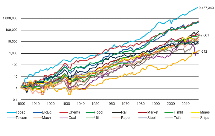
Figur 2.4 Cumulative value of $1 invested in US industries 1900–2017
Kilde: DMS (2015), French (2018), Thomson Reuters (2018), original chart © Dimson, Marsh, Staunton (2015) .
This large long-term variation in industry returns mirrors the dispersion of national equity market returns; see DMS (2018). We already know that past country returns provide little indication of future country returns. Predicting the fortunes of specific industries based on their past returns is similarly unlikely to be a successful. Indeed, Ilmanen (2011) argues that country and industry exposures are good examples of non-priced investment risks. A factor being priced would imply that it is expected to generate a long-run premium. Following Ilmanen, the prediction for an industry is that it would have an expected return that is close to other industries. Returns would be boosted or impeded only by industry exposure to priced factors such as a deviant market-to-book ratio or as a result of ostracism by a large cohort of investors.
For simplicity, we assume that industry exposure is not in itself a priced factor. However, sectors are not diversified portfolios, and they experience substantial tracking error over the long term as well as over the short term. Our analysis reveals striking return variation across sectors. Divesting from an industry, especially if it has a high market capitalisation and/or large idiosyncratic volatility, raises the likelihood of generating deviant portfolio performance. Conclusion: Over the long run we find that sectors do not provide returns close to the market.
2.4 Drawdowns with sector exclusion
While we have documented the variability of realised returns, we have cautioned against extrapolating industry performance into the future. Pástor & Stambaugh (2012) point out that from an investor perspective, expected returns are more volatile over long horizons than shorter ones. Crucially, they examine the predictive return variance, rather than the realised variance, as they argue it is more representative of the investor experience. Observers can estimate the parameters of the historical return process, but this may not reflect the true population parameters. The true data generating process is unknown, and this contributes to the predictive variance being larger than the realised variance of returns. While mean reversion may reduce long-term return variances relative to their short-term counterparts, the other components have a stronger impact, resulting in greater uncertainty about return variability in the long term.
To provide more insight into the impact of sector exclusion strategies, we therefore investigate a strategy of holding a portfolio long the market and short various sectors. This provides an indication of some of the uncertainties investors face in practice. While in hindsight drawdowns can prove to be transient, investors have no way of knowing how long they may last. Furthermore, during particularly low return periods they may also face pressure from stakeholders to abandon the particular strategy, which would result in locking in to unsatisfactory returns at a potentially disadvantageous time.
Figur 2.5 Cumulative total return for a fund long the market, short the oil sector
Kilde: DMS (2015), FTSE (2018), French (2018), Thomson Reuters (2018).
To illustrate the investment performance of the long-short strategy, we select oil as the sector to be shorted. The cumulative investment performance, plotted in Figure 2.5, is calculated in each period as:
(1 + Rmarket) / (1 + Rindustry)
The value of the portfolio for a period is multiplied by the value for the next period in order to generate a cumulative time series of total returns.
We now describe how we examine the downside risk from sector exclusion. Our focus is concern about switching from an unwanted exposure (for example, oil stocks) to a preferred alternative (for example, the equity market as a whole). The risk is the possibility of experiencing a dramatic fall in the value of the long-short portfolio (in our example, a long exposure to equities accompanied by a short position in oil stocks). Note that the long-short portfolio is automatically hedged against currency depreciation: losses will be attributable solely to the gap between the cumulative returns of the long and short positions.
Portfolio drawdowns are defined as the difference between the portfolio’s value on a particular date and its high-water mark (the highest historic value up to that date). The interval from the date of the high-water mark to breaching the high-water mark again is the recovery period. The investment is said to be underwater from the date of the high-water mark to the end of the recovery period.
Cumulative drawdowns are portrayed in Figure 2.6 as percentages of the high-water mark. In the left-hand panel we consider the downside of a holding that is long the UK market and short the UK oil sector. This is a position that might sit alongside a fully diversified equity portfolio for the rest of the fund. We measure the drawdown in value relative to the portfolio’s high-water mark.
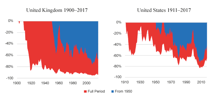
Figur 2.6 Drawdown charts for a fund long the market, short the oil sector
Kilde: DMS (2015), FTSE (2018), French (2018), Thomson Reuters (2018).
With extended intervals of good and poor investment performance, a crucial question is how deep portfolio drawdowns can be, and how long the recovery period can be. To provide an answer, we compute the cumulative percentage decline in value from a high to successive subsequent dates. This indicates just how bad an investor’s experience might have been if they had the misfortune to buy at the wrong time. The red area displays the results for the full analysis period, and the blue area calculates the drawdown percentage when starting the strategy from 1950.
Using annual data for the UK from 1900 to 2018, we look in the left-hand panel of Figure 2.6 at drawdowns for an oil-based long-short portfolio. The maximal drawdown is 96% (76%, from 1950). The downside risk for the US is similar. The right-hand panel of Figure 2.6 shows that, over the longest period for which we have a US oil index (1911 to 2018), the maximal drawdown is 83% (73%, from 1950).
Is the oil sector in some way unusual? Figure 2.7 presents histograms for the maximal drawdown for long-short portfolios constructed for each of the sectors plotted in Figures 2.3 and 2.4. The series all start in 1900 except the US oil sector which, as noted earlier, begins in 1911. At its most extreme, the deviation between the market and the excluded sector is between approximately 60% and—in the USA—approximately 99.5% (for the long-short portfolio based on tobacco).
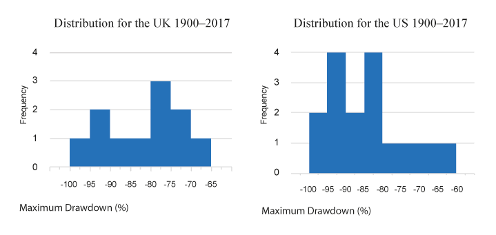
Figur 2.7 Maximum drawdown for a fund long the market, short an industry
Note: US oil index starts in 1911; all others in 1900
Kilde: DMS (2018), FTSE (2018), French (2018), Thomson Reuters (2018).
It is important to note that these drawdowns relate to the portion of an otherwise well-diversified fund that is subject to exclusion of a sector. The impact on the total fund would involve scaling the drawdown by the proportion of the overall portfolio that is subject to sector exclusion. For example, a drawdown of –50% as a consequence of divesting a sector position that comprises 2% of the total portfolio would give rise to a shortfall in portfolio value of 1%.
This long-term perspective is limited by the fact that we examine only one interval of 118 years. Furthermore, it may not be feasible to maintain absence to a sector for such a long interval. We therefore interrogate the historical record over one-decade intervals. There are 109 overlapping one-decade intervals, running from 1900–09 up to the most recent decade, 2008–17. We also replicate our analysis based on two-decade and three-decade intervals.
Figure 2.8 shows the dispersion of annualised industry returns in the UK (left-hand panel) and in the USA (right-hand panel). For each country, keeping the same sample of industries as before, we calculate annualised (i.e., geometric mean) returns for one, two, and three decades of running the long-short strategy for each sector using one year rolling windows. We then average the rolling windows of annualised returns for each sector and decade interval. Finally, we calculate the dispersion of average annualised returns per sector for each decade interval and plot relevant percentiles of the distributions.
The clusters of bars display the variation of geometric mean returns estimated over rolling windows of 10 years (in the left of each panel), 20 years (in the middle), and 30 years (in the right of each panel). Within each cluster we report the 5th and 95th percentiles, and the quartile boundaries.
Over all horizons and all sectors, and generalising across countries, the worst five percent of long-short positions had annualised returns of –1½% or less while the best five percent had annualised returns of +2% or more. The median return is close to or slightly above zero. The interquartile range is distributed around the median within an approximate range of plus or minus 1%. The range is slightly wider in the United States than in the United Kingdom, which is consistent with the larger number of industries identified in Figure 2.4 for the US market, as compared to the UK which has fewer industry categories (see Figure 2.3). It can be seen that the distribution of annualised returns from the long-short portfolio is approximately symmetric. As one would expect, there is no indication of a risk premium, whether positive or negative, arising from industry exclusion.
Based on our historical evidence, shorting sectors in favour of the overall market would have been a risky strategy in the sense of introducing potentially substantial tracking error relative to the overall market or relative to standard benchmarks for performance. Conclusion: Over a 10–30 year horizon, sector exclusion exacerbates the risk of underperformance.
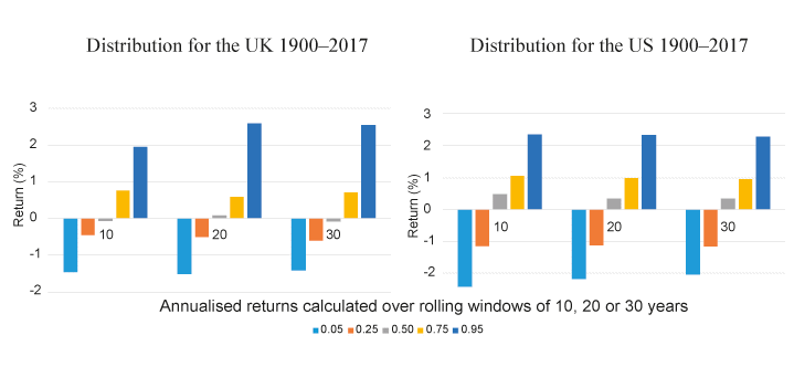
Figur 2.8 Annualised return of a fund long the market, short an industry
Kilde: As for Figure 2.7.
2.5 Do resource-company share prices mimic resource prices?
Resource company shares differ from direct resource ownership. Companies can manage production levels in light of output prices, extraction costs, and other factors. Even when a mine or well is undeveloped, there is a possibility that prices will become favourable in the future, and this optionality is valuable. Consequently, resource companies’ shares generally sell for more than the value of the mineral minus the present value of extraction costs.
Figure 2.9 shows the inflation-adjusted price index for valuable mineral resources from 1900 to 2017. Only platinum outperformed cash (treasure bill returns) over the whole period, and that was due to particularly strong performance in the early 1900s. Over the period since 1900, the annualised capital appreciation for the five minerals was diamonds -0.5%, silver 0.002%, oil 0.3%, gold 0.7%, and platinum 1.4%. Over the same interval, cash (Treasury bills) provided an annualised real rate of return of 0.8%.
Historically, equities have provided a risk premium to investors. In all of the 21 markets with an unbroken history over the period 1900–2017, DMS (2018) find the long-term return on equities exceeded inflation, and also exceeded the return on long-term government bonds and the return on Treasury bills. In contrast to equities, the mineral resources plotted in Figure 2.9 have almost all failed to provide a risk premium, even compared to cash, for a variety of reasons that are discussed by DMS (2018).
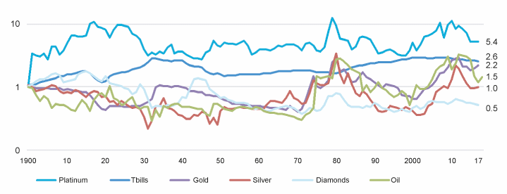
Figur 2.9 Price indices for minerals in inflation-adjusted US dollars, 1900–2017
Kilde: onlygold.com (2018), Officer and Williamson (2018), US Geological Survey (2018), Stooq (2018), Katzav/IDEX (2018), Spaenjers (2016), BP (2018), DMS (2018), original charts © Dimson, Marsh, Staunton (2018).
The long-term price appreciation for minerals falls far short of the level of equity returns. It follows that investors would likely have achieved superior returns from buying into shares in resource extraction companies rather than holding the underling minerals. At the same time, however, mineral resource returns could still be related to equity returns. To investigate this, we run several regressions of the change in (the log of) mineral prices on the change in (the log of) market returns from 1911 (the base date for the US oil index) to 2017. Of all five minerals, platinum is the most positively associated with world equity returns, whereas oil has a weak negative association. All other minerals are insensitive to the world equity market return.
Our regression results are reported in Table 1. World and US equity market returns come from DMS (2018) and US oil sector returns come from Cowles (1938) and French (2018). Oil prices are from the BP (2018) Crude Oil Price Index. Using the inflation data in DMS (2018) we convert the total returns and price series to inflation-adjusted returns and prices. We then calculate log returns for the series, which is:
Returnt = ln (Pt / Pt-1)
where we take the log of the ratio of the price (or total-return) index in one period and the preceding period. The regressions are then run for these log returns series.
Mineral prices are the dependent variables in the regressions since stock market prices impound beliefs about current and future resource prices. Spot resource prices, on the other hand, are unlikely to incorporate information about future stock price fluctuations. However, the interpretation of our results does not rely on the direction of causality.
There is a low correlation between (logarithmic) changes in oil prices and the corresponding (logarithmic) stock market returns from investing in the US oil sector, with the regression having a negative adjusted R-squared. This suggests that oil sector stock market returns are not a suitable hedge for oil price returns. The association only becomes significant after accounting for US and world market returns. The low correlations between (logarithmic) changes in other mineral prices and the corresponding (logarithmic) world equity market returns corroborates the challenge of hedging mineral prices using equities or vice versa. Conclusion: It is unlikely that equity sectors will hedge exposure to the fluctuating value of a mineral resource.
Tabell 2.1 Regressions of change in mineral price on market returns, 1911–2017
Independent variable→ | Oil price | Oil price | Oil price | Platinum price | Gold price | Silver price | Diamond index |
|---|---|---|---|---|---|---|---|
Constant | 0.017 | 0.026 | 0.026 | –0.012 | 0.005 | –0.007 | –0.007 |
(0.025) | (0.023) | (0.023) | (0.019) | (0.016) | (0.022) | (0.012) | |
US oil-sector market return | –0.079 | 0.435** | 0.432** | ||||
(0.112) | (0.166) | (0.166) | |||||
US equity market return | –0.719*** | –0.500* | |||||
(0.181) | (0.301) | ||||||
World equity market return | –0.263 | 0.250** | 0.070 | 0.173 | –0.014 | ||
(0.289) | (0.104) | (0.085) | (0.120) | (0.067) | |||
Number of observations | 107 | 107 | 107 | 107 | 107 | 107 | 107 |
Adjusted R2 | –0.005 | 0.120 | 0.118 | 0.043 | –0.003 | 0.010 | –0.009 |
F Statistic | 0.507 | 8.198*** | 5.732*** | 5.776** | 0.662 | 2.099 | 0.047 |
* denotes p<0.1,
** denotes p<0.05, and
*** denotes p<0.01
Kilde: As for Figure 2.9. Also see text.
2.6 Should a long-term investor avoid declining industries?4
The Industrial Revolution in the UK in the later part of the 18th century was underpinned by inventions such as the spinning jenny and power loom, as well as advances in metallurgy and steam technology. However, transporting these new goods was challenging. The development of canals met that need while at the same time proving a disruptive technology for wagon and horse proprietors. They struggled to compete with a transportation method that provided sixty times more efficient transportation measured in ton-miles per day.
However, canal investors did not experience a smooth ride. Nairn (2002) notes that over 60 canal companies floated on the London Stock Exchange between the late 18th century and 1824, raising over £32 billion at today’s prices. Notably, there was a canal boom in 1772 followed by a crash in the market in the following year. Though no indices exist for that period, Figure 2.10 (left-hand panel) shows canal stock prices from 1811 to 1850. Canals experienced a rise of 140% from 1816 to 1824 until, in 1825, another disruptive technology emerged with the completion of Stockton and Darlington Railway. Eventually, railway cargo transport would achieve 60 times the efficiency of canals in ton-miles per day and in the following 25 years prices of canal stocks would drop by more than 70%. While the data excludes dividends, it is likely that that total returns from shares in canals were deeply disappointing.
The right-hand panel of Figure 2.10 shows the evolution of UK railway share prices. They experienced intervals of growth and decline: prices rose by over 100% in 1835 and then declined to their original level over the following years. This story recurred in 1845 with another doubling in prices followed by a more than 60% drop by 1849. However, despite the turbulence of returns, over the more than 20 years displayed on the chart, investors earned an annualised capital return of 3% as well as dividends.
Nairn (2002) examines disruptive technologies from canals and railroads to the telegraph, electricity, and other consecutive inventions, ending with the internet. He concludes that new technologies tend to face initial distrust and ridicule. Subsequent reactions turn into exuberance which can often manifest itself as a stock market “bubble”, the aftermath of which is more subdued and level-headed valuations. Crucially, firms that profited from emerging technologies over the long-run benefited from monopoly protections, as well as other barriers to competition and maintained a defensible advantage. In financial terms, the major beneficiaries have often been the innovators and the company founders—not necessarily stock market investors.
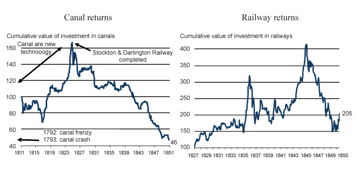
Figur 2.10 Disruptive technologies in the 19th century
Kilde: Gayer, Rostow and Schwartz (1953), original charts © Dimson, Marsh, Staunton (2015).
This is not to say that mature, diminishing industries cannot deliver satisfactory returns. One such example is railroads, which made up 63% of the US market in 1900 and are presently below 1% (see Figure 2.2 above). Railroad returns, alongside market returns and returns for airlines and road transport firms (buses, trucks, and others) are displayed in Figure 2.11. Since airlines and road transport returns are only available from 1934 and 1926 respectively, they are both plotted from those years, rebased to the value of railroad index in the starting year for the additional indices.
In fact, despite trailing the market prior to the 1970s, due to disruption from air and road travel, railroads have beaten the market over the entire period from 1900 to date. Railways struggled during 1950–1970 as interstate highways were completed, cars became more prevalent as a means of transport, and airlines were also on the rise. This resulted in a number of bankruptcies within the industry, the most notable being that of Penn Central in 1970. At that time, this was the biggest bankruptcy in US corporate history. However, railways went on to recover, and over the following decades they outperformed not only the overall equity market but also rail and air transport returns. Siegel (2005) notes that, in hindsight, the earlier setbacks caused railroad prices to fall excessively. Industry reorganisation, deregulation and efficiency improvements assisted the rebound. In comparison, airlines performed the worst of the three transport indices, consistent with Warren Buffett's well-known observation on the Wright Brothers that “If a farsighted capitalist had been present at Kitty Hawk, he would have done his successors a huge favour by shooting Orville down”(Buffett and Olson (2017)).
Many of the stranded assets of recent times have been technological. Between 1999 and 2001 the formerly high-flying TMT (technology, media and telecom) sector was decimated. Unwanted software declined in value to zero. Yet, as we discuss in the next section, this distressed industry eventually prospered, to the advantage of diversified, long-term investors. Conclusion: Industries in decline can provide attractive returns to long-term investors.
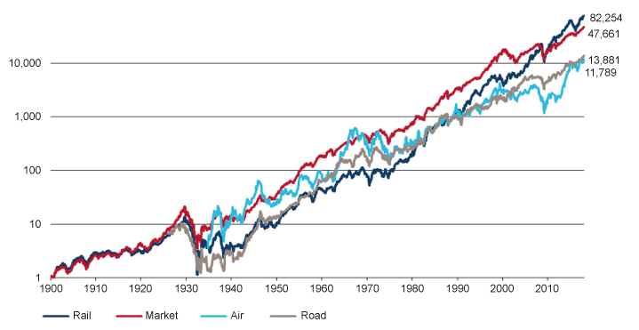
Figur 2.11 Cumulative value of $1 invested in transportation stocks, US 1900–2017
Kilde: DMS (2015), FTSE (2018), Thomson Reuters (2018), original chart © Dimson, Marsh, Staunton (2015).
2.7 Should a long-term investor favour growth businesses?5
New industries list on the stock market via an initial public offering (IPO). The S&P 500, initiated in 1957, contains the 500 “leading firms in leading industries,” and requires regular rebalancing. New companies can enter at the IPO stage or once they are sufficiently large. Siegel (2005) notes that by 2003, there had been 913 entrants to the index (and, in the opposite direction, numerous exits). He shows that a superior return strategy to holding the S&P 500 would have been buying the original constituents and holding them over time, only reinvesting proceeds from firm deaths into the remaining firms. He rationalises the result by stating that “Investors have a propensity to overpay for the “new” while ignoring the ‘old’… growth is so avidly sought after that it lures investors into overprices stocks in fast-changing and competitive industries, where he few big winners cannot compensate for the myriad of losers.”
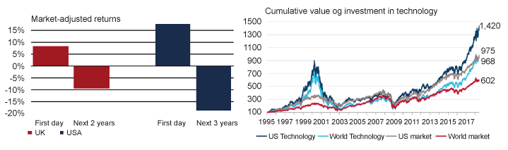
This chimes with the academic literature on IPOs, as depicted in Figure 2.12 (left-hand panel). Ritter's (2018) analysis of 8,360 US IPOs during 1980 to 2017 shows that buying IPOs at the issue price delivered 17.8% first day returns. Subsequently, over a three-year horizon, investors experienced a market-adjusted loss of 18.5%. Similarly, in Dimson and Marsh's (2015) study of 3,507 UK IPOs in the period 2000 to 2014, the market-adjusted first day return was 8.5% vs a market-adjusted loss of 9.4% over the next two years. Gregory et al (2010) show that this cumulative underperformance is not reversed even over a five-year period.
Loughran and Ritter (1995) claim that IPOs are consistently overpriced. “For IPOs the prior rapid growth of many of the young companies makes it easy to justify high valuations by investors who want to believe that they have identified the next Microsoft.” However, this does not resolve the puzzle of why investors fail to adjust their beliefs in the presence of widely documented evidence of poor IPO returns. A behavioural bias could be at play, according to these authors: “Investors are betting on longshots [and] seem to be systematically misestimating the probability of finding a big winner. It is the triumph of hope over experience.”
Figur 2.12 Returns on IPOs (LHS) and long-term return on technology stocks (RHS)
Kilde: Ritter (2018), Dimson and Marsh (2015), FTSE (2018), Thomson Reuters (2018), original charts © Dimson, Marsh, Staunton (2015).
The long-term record should, however, be interpreted with care, as is illustrated by the dot-com bubble and subsequent history. The right-hand panel of Figure 12 displays the total returns on the FTSE technology sector since the 1995 birth of the tech-bubble. The sector includes both software and hardware companies. Returns for the US technology sector are in dark blue, and those for world technology are in light blue. For comparison, overall US market returns are in grey and world equity market returns are in red. During the boom, which peaked in March 2000, the US tech market reached nine times its 1995 value. In the following two-and-a-half years the technology sector would lose 82% of its value. Yet, as of June 2018, the market has not only recovered but has risen 57% above the value of the previous boom. A buy-and-hold investor would have made money investing in technology at any point in the last 22 years, and performance would have been superior to the US equity market. The annualised 22-year return to start-June 2018 for the US Tech Market is 11.56% versus 10.06% for the overall US market.
Investing in new technology and growth businesses is not for the faint hearted, and the lessons from history are nuanced. It is possible to overpay for exciting growth opportunities, yet the long-term record of technology makes it clear that there is no simple rule that will generate the right decision. To the extent that IPOs tend to be growth stocks and belong to growth industries, their disappointing performance is in line with well-publicised results that growth stocks have historically underperformed the market and value stocks in the long run. Whether the value premium is a compensation for a risk factor or stems from behavioural reasons is not yet clear. The central behavioural story is the one proposed by Loughran and Ritter, whereby investors have strong affinity for growth stocks and purchase them undeterred by their steep prices.
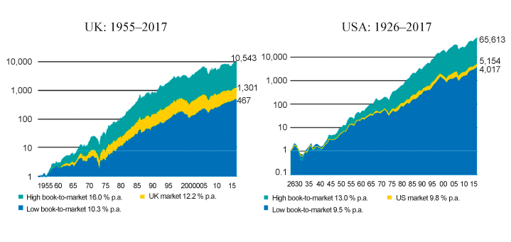
The underperformance of growth stocks is apparent in Figure 2.13. The left-hand panel compares the long-run return from UK equities with a low book-to-market (i.e., growth stocks, in blue) against UK equities with high a book-to-market (i.e., value stocks, in turquoise). A £1 investment in the growth index in 1955 would have grown in nominal terms to £467 by end-2017, an annualised return of 10.3%. The same initial investment allocated to the value index would have generated £10,543, more than 22 times as much and equivalent to an annualised return of 16.0%. The right-hand panel presents confirmatory evidence for the USA. Despite growth stocks having done well after 2007, they have drastically underperformed over the long haul. This is true in the UK and USA, and, as DMS (2017) report, all over the world.
While new technologies can disrupt existing ones, from the point of view of the investor they do not always present the most promising opportunities. Conclusion: This decade’s growth sectors may be next year’s stranded assets.
Figur 2.13 Long-term investment performance of growth stocks vs value stocks
Kilde: French (2018), Dimson, Nagel and Quigley (2003), DMS (2017, 2018), Thomson Reuters (2018), original charts © Dimson, Marsh, Staunton (2017, 2018).
2.8 Global impact of sector exclusion6
In this section, we examine the interactions between geographic and sector allocation and the implications of sector exclusion for portfolio allocations. We use country and sector weightings data from the constituents in the FTSE All World Index. Figure 2.14 displays sector proportions in the world market, as well as for the USA, UK, Japan, Germany, and Emerging Markets. We use the ten sectors from the ICB (Industry Classification Benchmark) standard. The world index used is the FTSE Russell All World Index and is plotted as a basis for comparison with the overweight and underweight positions in the other series.
There are large disparities in sector weighting across regional markets. The USA has a particularly large allocation to technology (22%), as well as consumer services and healthcare. In contrast, the UK has minimal weight in technology (1%), but is heavily tilted towards resources, with oil & gas at 16% and basic materials at 9%, which includes mining. Consumer goods are also overweight vs the world market (at 16%), and financials are high in absolute terms (21%).
The Japanese and German markets share some similarities. Both have substantial allocations to manufacturing industries (industrials), but very low exposures to oil & gas resources. Germany has a larger weighting to basic materials (14%), which is due to the chemicals sector. Furthermore, both countries are over-exposed to consumer goods, where automobiles are the largest contributor. Japan has a low relative exposure to healthcare, and Germany to consumer services.
Emerging markets generally have a high allocation to financials (28%, over 60% of which is in banks), and are also slightly overweight in oil & gas, basic materials, and technology. On the other hand, they are particularly under-exposed to healthcare. Furthermore, they are underweighted in consumer goods but overweighed in consumer services.
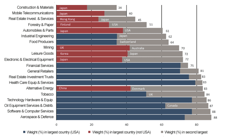
We proceed to compare industry concentration within individual countries. The same ICB classification used in the preceding analysis separates the ten sectors used earlier into 41 industries (for 39 of which we have country weightings). Figure 2.15 takes a selection of the countries and industries and reports the national and sector weightings.
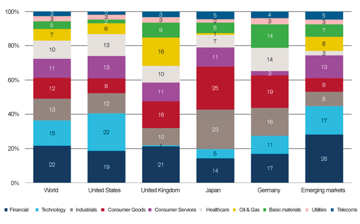
Figur 2.14 Sector weights for the world and for major markets as at June 2018
Kilde: FTSE (2018), original chart © Dimson, Marsh, Staunton (2015).
Figure 2.15 shows the country with the largest weight (blue if the USA, and otherwise red with a country label) as well as the second-largest country in grey (labelled if over 20%). The USA comprises just over half of total world market capitalisation and has the largest industry weight in 30 industries. The nine cases where the USA is not the biggest industry contributor are in red. Japan is the top player in automobiles and parts, electronic & electrical equipment, mobile telecommunications, and construction & materials. Hong Kong leads in real estate investment & services; UK in mining; China in alternative energy; South Korea in leisure goods; and Finland in forestry and paper.
Figure 2.15 also contains all industries where either the USA industry contributes more than two thirds of the industry total, or the weight of the second largest country is over 20%. This reveals that Canada is an important contributor to oil equipment services & distribution; UK to tobacco; Denmark to alternative energy; Japan to leisure goods, industrial engineering, and real estate investment & services; Australia to mining; Switzerland to food producers.
To summarise, industries display pronounced country concentrations. For 31 out of 39 industries, the two countries with largest weights make up over 50% of the world industry market capitalisation; for 28 industries they make up more that 60%, for 18 industries they make up more than 70%, and for nine industries more than 80%.
Figur 2.15 Country concentration of FTSE All World Index sectors as at June 2018
Kilde: FTSE (2018), original chart © Dimson, Marsh, Staunton (2015).
In the same manner that industries appear prone to country concentration, countries can also be over-exposed to particular industries. Figure 2.16 displays the weight of the three largest industries in each country. We have selected 26 out of the 47 countries in the FTSE All World Index, choosing the top and bottom five countries by concentration, as well as all the countries covered in the DMS (2018) Global Investment Research Yearbook.
In the four countries displayed at the top of the chart, three or fewer industries account for the entire country’s market capitalisation. On the other hand, the least concentrated countries are Japan, France, the USA, Germany and the UK, where the three largest countries still make up between 25% (Japan) and 37% (UK) of total market capitalisation. When looking at all 47 members of the FTSE All World index, in 42 out of 47 the top three industries make up more than 40% of total country market capitalisation; in 34 countries, they make up at least 50%, in 23 countries they make up a least 60%; and in 13 at least 70%.
Our discussion highlights changes to the proportion of a county’s market to which an investor is exposed. For example, if 40% of a country’s stock market is taken up by a specific sector, then by excluding that sector from an investment portfolio, the portfolio’s exposure to the country’s market is almost halved. Another way to look at changes to country exposure would be to discuss the change of a country’s weight in the total index following sector exclusion. For example, if the country made up 2% of the world market, after the sector exclusions it would comprise 1.2% of the world market (40% lower), making the exposure change roughly 0.8% (this is an approximation as the precise exposure change would depend on the new, ex-sector benchmark following exclusion). Discussed in that framework, the change to the country exposure would seem much smaller. While both approaches have merit, we stress the proportional change in country weightings to draw attention to the impact of sector divestment on exposure to emerging markets and smaller economies.
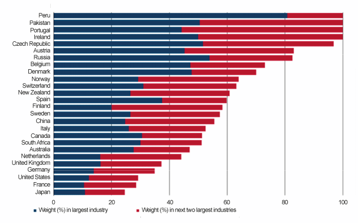
Figur 2.16 Sector concentration of FTSE All World Index countries as at June 2018
Kilde: FTSE (2018), original chart © Dimson, Marsh, Staunton (2015).
Investors who focus on specific countries will usually have poorly diversified portfolios, especially if they favour stocks located primarily in their home market. A sector-screened portfolio may be regarded as an active-passive blend of a diversified long-only portfolio plus a long-short overlay. That overlay is likely to incorporate unwanted geographic tilts alongside the sector (or other) attributes that underpin the screen. Conclusion: sector or industry exclusion is likely to generate collateral tilts away from particular countries.
2.9 Conclusion
There are a variety of motivations which can drive investors to engage in sector exclusion. These can range from beliefs about the future return prospects for particular sectors, to attempts to hedge the risks of existing holdings, or a desire to invest in line with particular ethical considerations. Over a brief horizon, exclusions are unlikely to have a large influence on prices. Atta-Darkua (2018), for example, documents that while GPFG divestment recommendations have a negative impact on the price of excluded firms, the impact is small in magnitude as well as transitory. And although product-based exclusions, such as coal production, are subsequently mimicked by some ethics-sensitive investors, the scale of their divestment is again modest. Over the long term, however, divestments are likely to have a more pronounced impact on investment returns.
In this paper we examine exclusions from the point of view of a well-diversified long-term investor. We employ a dataset of UK and USA market and sector returns starting in 1900 in order to have a long term perspective, and make periodic comparisons with global evidence. We document that over the long run sectors do not provide returns close to the market, making the overall equity market an imperfect substitute for any given sector’s returns. Furthermore, sector exclusion exposes investors to substantial drawdowns in the component of the portfolio that is exposed to this strategy. The risks of screened strategies underperforming a diversified portfolio are non-trivial. Even if drawdowns are eventually reversed, investors may face pressure to abandon the sector exclusion strategies at a time when they are performing particularly poorly, thus locking in the bad performance.
We find that the equity market is a poor hedge for investors seeking to offset the price volatility of a mineral resource. Over the long term, real cash returns from equities have been higher than those from any of the high-value mineral resources which we analyse. Furthermore, from a long-term perspective, real oil prices in particular were found to be uncorrelated with real US oil sector market returns.
Although declining industries have often suffered from disappointing returns while they are under attack from new technologies, over the long term they can still deliver a satisfactory performance. In contrast, industries on the rise may ultimately fail to translate their disruptive influence into profits for investors. Moreover, although growth sectors such as technology have performed well recently, investors should not forget that they are prone to experiencing boom and bust cycles and that the long-term trend has been for value to outperform growth.
Finally, global investors need to be mindful that sectors can be concentrated in specific geographic locations. Sector exclusions may introduce active country exposures into portfolios. Overall, our analysis suggests that in the long run the consequences of sector exclusions can be substantial rather than minor. While exclusions may generate financial rewards for an investor, sector exclusions can also introduce unrewarded downside risks into the investor’s portfolio.
2.10 References
Atta-Darkua, V. (2018) ‘Corporate Ethical Behaviours and Firm Equity Value and Ownership: evidence from the GPFG’s ethical exclusions’, Working Paper, Cambridge Judge Business School.
BP (2018) BP Statistical Review of World Energy 2017. BP p.l.c.
Buffett, W. and Olson, M. (2017) ‘Berkshire Hathaway letters to shareholders’. Explorist Productions.
Cowles, A. and others (1938) Common-stock indexes. Principia Press.
Dimson, E., Ilmanen, A., Liljeblom, E. and Stephansen, Ø. (2010) ‘Investment Strategy and the Government Pension Fund Global’, Oslo: Norwegian Ministry of Finance.
Dimson, E., Kreutzer, I., Lake, R., Sjo, H. and Starks, L. (2013) ‘Responsible investment and the Norwegian Government Pension Fund Global’, Oslo: Norwegian Ministry of Finance.
Dimson, E. and Marsh, P. (2015) Numis Smaller Companies Index Annual Review, 2015. London: Numis Securities.
Dimson, E., Marsh, P. and Staunton, M. (2002) Triumph of the Optimists: 101 Years of Global Investment History. Princeton, NJ: Princeton University Press.
Dimson, E., Marsh, P. and Staunton, M. (2015) Credit Suisse Global Investment Returns Yearbook 2015. Credit Suisse Research Institute Zurich.
Dimson, E., Marsh, P. and Staunton, M. (2017) ‘Factor-based investing: the long-term evidence’, Journal of Portfolio Management, 43(5), pp. 15–37.
Dimson, E., Marsh, P. and Staunton, M. (2018) Credit Suisse Global Investment Returns Yearbook 2018. Credit Suisse Research Institute Zurich.
Dimson, E., Nagel, S. and Quigley, G. (2003) ‘Capturing the value premium in the United Kingdom’, Financial Analysts Journal, pp. 35–45.
French, K. R. (2018) ‘Data library’, Tuck School of Business at Dartmouth College. Available at mba.tuck.dartmouth.edu/pages/faculty/ken.french/data_library.html.
FTSE Russell (2018) FTSE All-World Index Series, Monthly Review, June 2018.
Gayer, A. D., Rostow, W. W. and Schwartz, A. J. (1953) Economic Fluctuations in the British Economy, 1790–1850. Oxford: Oxford Univ. Press.
Gregory, A., Guermat, C. and Al-Shawawreh, F. (2010) ‘UK IPOs: long run returns, behavioural timing and pseudo timing’, Journal of Business Finance & Accounting. Wiley Online Library, 37(5–6), pp. 612–647.
Ilmanen, A. (2011) Expected returns: An investor’s guide to harvesting market rewards. John Wiley & Sons.
Katzav/IDEX (2018) Diamond Prices Data Source. Available at: http://www.idexonline.com/.
London Share Price Database (2018) Data. Available at: https://www.london.edu/faculty-and-research/subject-areas/finance/london-share-price-database#.
Loughran, T. and Ritter, J. R. (1995) ‘The new issues puzzle’, The Journal of finance. Wiley Online Library, 50(1), pp. 23–51.
Nairn, A. (2002) Engines That Move Markets: Technology investing from railroads to the internet and beyond. John Wiley & Sons.
Norges Bank Investment Management (2017) ‘Investment Strategy for the Government Pension Fund Global. Letter to the Ministry of Finance, dated 16 November 2017’. Available at: https://www.nbim.no/en/transparency/submissions-to-ministry/2017/investment-strategy-for-the-government-pension-fund-global/.
Officer, L. H. and Williamson, S. H. (2018) The Price of Gold, 1257–Present, MeasuringWorth. Available at: http://www.measuringworth.com/gold.
onlygold.com (2018) Gold Price Data Source. Available at: http://onlygold.com.
Pástor, L. and Stambaugh, R. F. (2012) ‘Are stocks really less volatile in the long run?’, The Journal of Finance. Wiley Online Library, 67(2), pp. 431–478.
Ritter, J. (2018) Initial Public Offerings: Underpricing. Available at: https://site.warrington.ufl.edu/ritter/files/2018/07/IPOs2017Underpricing.pdf.
Siegel, J. J. (2005) The future for investors: Why the tried and the true triumphs over the bold and the new. Crown Business.
Skancke, M., Dimson, E., Hoel, M., Kettis, M., Nystuen, G. and Starks, L. (2014) ‘Fossil-Fuel Investments in the Norwegian Government Pension Fund Global: Addressing Climate Issues through Exclusion and Active Ownership’, Report by the Expert Group appointed by the Norwegian Ministry of Finance.
Spaenjers, C. (2016) ‘The Long-Term Returns to Durable Assets’, in Chambers, D. and Dimson, E. (eds) Financial Market History: Reflections of the Past for Investors Today. Charlottesville, VA: CFA Institute Research Foundation, p. 86.
Stooq (2018) Platinum Price Data Source. Available at: https://stooq.com.
Thomson Reuters (2018) ‘Thomson Reuters Datastream Database’.
US Geological Survey (2018) Data. Available at: https://www.usgs.gov.
Fotnoter
For comments, we thank Øystein Thøgersen (Norwegian Business School), Harald Magnus Andreassen (Sparebank1 Markets), Olaug Svarva, David Chambers and Ellen Quigley (Cambridge University). For access to data, we thank Paul Marsh and Mike Staunton (London Business School) and Philip Lovelace (FTSE Russell). This paper reproduces substantial material from Elroy Dimson, Paul Marsh and Mike Staunton, ‘Industries: Their Rise and Fall’, chapter 1 of Dimson, Marsh and Staunton (2015). Data have been updated to 2018 by Vaska Atta-Darkua.
This section reports findings presented previously by DMS (2018).
This section updates charts and text presented previously by DMS (2015).
This section draws on Nairn (2002) and includes DMS (2015) material updated by the current authors.
This section reports findings co-authored by Dimson and Marsh (2015).
This section is a fully-updated version of material from DMS (2015)